
One of the first things we look at when working with new clients is their website. Why?
Your website is the foundation of your digital marketing strategy and without a well performing website you are literally pouring water down the drain. When you spend budget to generate website traffic and potential leads arrive on your site and have a poor experience they are not going to convert to hot leads for you. They will leave disappointed and go right to a competitor who has done a better job of explaining what they do, who they are and why you should get in contact.
So, before you even consider investing in a digital marketing strategy we recommend you make your website as strong as you can to set you up for success.
Website design is often a missed or neglected starting point for several reasons:
1. An overeager partner who wants you to sign up to their marketing right now. In our experience you end up shooting yourself in the foot and campaign failure is blamed on the marketing when the reality is, it was never going to succeed because the website was in poor shape. And you waste money. Lose lose for both client and agency.
2. Budget related. We totally understand this. You might have even just spent money on getting it designed and are then told it needs more work. But if you don’t make the improvements you’ll end up frustrated and have to do it later anyway after having wasted marketing dollars.
You don’t have to do it all at once - small changes over time can help.
Websites don’t have to be a static ‘do it once every 3-4 years’ exercise and we don’t recommend this. You want to be able to adapt and change as necessary and try things out. If you do have budget you can A/B test new ideas and make those small changes over time.
How do you know if your website needs to be improved?
Well, firstly, most websites can be improved.
There are 3 key areas we review when working with clients to understand how their website performs and to provide a workable list of actionable's to implement. These may be done immediately, tested, or done over time.
- Technical performance
- Design, messaging, imagery, trust
- Use of Call to Action
What about e-commerce sites?
While all the recommendations do apply for ecommerce, you also have the added factor of the buying online experience and the experience through your shopping cart. E-commerce analysis goes deeper into the purchase funnel where you can analyse drop off's at specific points in the process and uncover improvements from there. That’s a big topic for another day - but one we dearly want to address because it’s fun stuff! Well, us nerdy digital marketing people find it so.
1. Technical Review
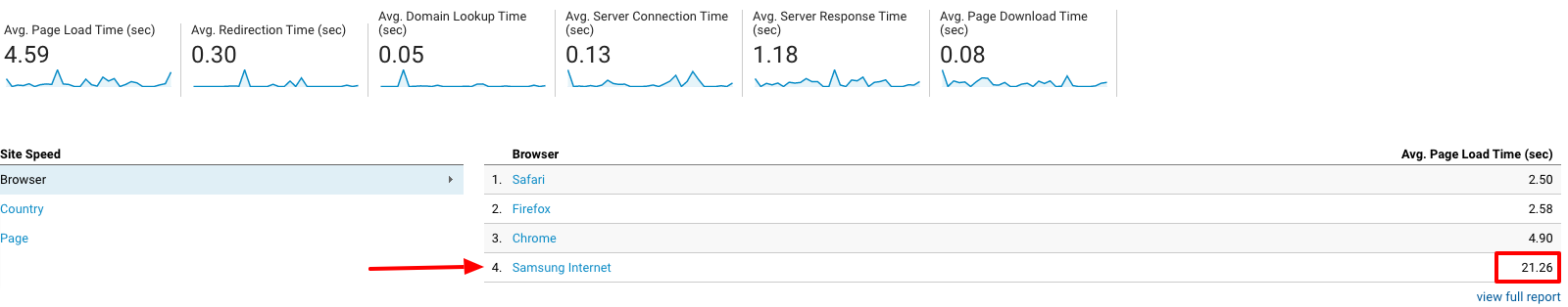
Does it load quickly, especially on mobile.
We all know from our own experience that there is nothing more painful than a site that loads too slowly. It’s frustration city for the user and will make them leave your site in a heart beat.
You can test your website speed by checking out
- Google Analytics / Behaviour / Site Speed
- Google pagespeed insights https://developers.google.com/speed/pagespeed/insights/
It can be common for speed to be different across different browsers so if you spot any behaving badly in Google Analytics then ask your developers to check it out and see if there are any issues or quick fixes.
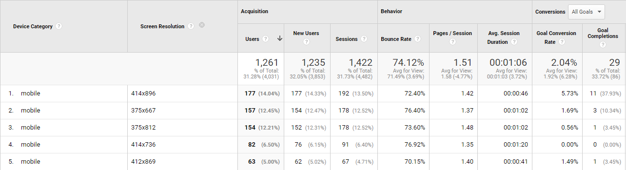
Are you losing conversions on specific devices?
As with speed, sometimes you can be leaking conversions on specific devices that show a conversion rate way lower than others. For example, mobile device 414x736 below has the 4th highest traffic yet has had 0 conversions. Have your developers take a look and potentially try some device testing and see if they can identify any issues. Sometimes it can be hard to replicate but all these small things can add up to lost conversions for your business. We all want that silver bullet and that ONE thing you change that makes a huge impact but the reality is, small incremental improvements over time that improve user experience will impact over time and plug the leaky holes in your site.
What is your conversion path length?
The conversion path length is the time it takes for a customer to convert on your site alongside how many ads or touch points were needed before a conversion took place.
Typically, many conversions take place on the first visit. Depending on your product or service we sometimes often see with the next highest # of conversions between 12-30 days. This could mean users are coming back in different buying phases, and require more information before they take a conversion action.
Why is this important?
If a visitor isn’t getting what they need on the first visit, you could be thinking about what you do to provide relevant content to them. For some industries this might mean downloadable content, and also setting up remarketing campaigns to bring people back to your site for another crack.
2. Design, messaging, imagery, trust.
We’ve been designing websites for a while now and we combine this experience with deeper knowledge of Conversion Optimisation to comb through your website and make note of immediate and obvious red flags that we believe deserve attention.
This includes things like:
First impressions.
You have about 2-3 seconds to make a great impression on your audience when they arrive at your website. It happens instantaneously and subconsciously. With these 3 questions in most people’s minds:
- Who are you?
- Can I trust you / do I like you
- Do you have what I’m looking for
While having a pretty website is good for an overall sense of trust and professionalism by far the most important part of your website is the copy!
Do you have a cohesive statement of your value proposition so that you can clearly articulate what you do to solve problems for your clients?
Messaging is probably THE most crucial part of your website in terms if impacting conversion. The main banner copy MUST SHOWCASE your value proposition. The main banner image must align to that proposition tightly. When they don’t, you destroy trust and it’s confusing for people.
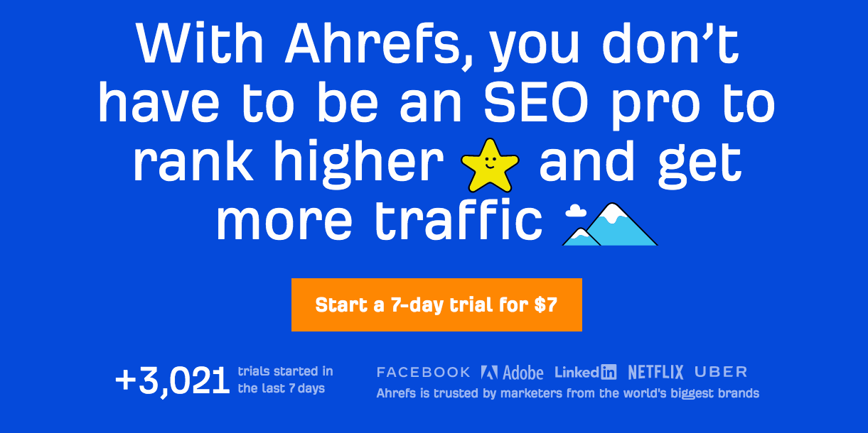
In the Ahrefs example below it clearly states that they can help you ‘rank higher and get more traffic’. They don’t use ‘we do….’ - rather it's completely focused on what YOU will get out if it.
Then they tell you exactly what they want you to do - Start a $7 DAY TRIAL.
And underneath that they build trust by stating 3,701 trials started (lots of people are doing it so you should too), and it’s used by Facebook, Adobe, Netflix and Uber. So it must be good!
Images
Super super important for ecommerce websites. Images and product descriptions can make or break your online sales.
Crappy images that are poorly focused, don’t align to the message, appear out of place, are dated or not treated well can have a hugely damaging impact on your site.
Image treatment is about site polish - you can tell the care and attention given to a site by the treatment of images and this does reflect on the brand and how they do business.
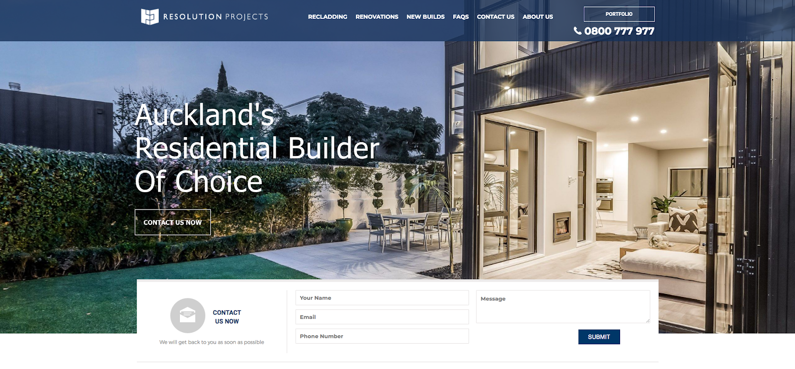
For example, if you were going to hire a renovations company would you trust them if they had poor images showcasing their work? See these before and after photos.
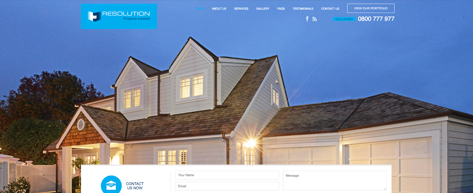
We helped redesign the website, updated images and copy to improve conversion and market positioning.
Are you building trust on your website quickly?
With client logos, industry associations, secure payments, reviews and the like. You see this quite often and it’s something we often recommend to clients to help their potential clients understand who they might work with, how people might find their products and services and whether they abide by any industry standards. There is an element of ‘tick the box’ with trust icons but they do often have a bearing on conversion and positioning your brand as trusted experts.
Clear Call to Action’s (CTA)
CTA’s can be tricky to get right and the best way to decide what to use and where to place them is to have a goal for your page and use the CTA that aligns to your goal.
For example, it’s really common to put a CTA of ‘Get in Touch’ on the home page banner but is that simply asking too much of new customers too soon? For many it will be as they don’t even know you yet. They aren’t sure whether you can solve their problem and may need more information. Therefore a CTA like ‘Learn More’ might be more appropriate and you can take them to the pages on your website where you go into a bit more detail about your offering to build confidence and trust that you are the right person to be talking to.
Another option for those you are brand new to your brand and don’t want to talk to you just yet is using highly valuable content to download in exchange for an email address. This does 2 things
1. Provides value to your potential client and starts the relationship
2. Enables you to follow up with highly targeted and personalised content or email to nurture the relationship over time
Too many CTA’s
We see this also - where the website has just too many places and options for converting and it ends up confusing the customer and they do nothing.
Behavioural Analysis Tools to get additional data.
A lot of this can be subjective so we use tracking tools like Hotjar (which has heatmaps and session recordings) and Crazy Egg to understand what people are doing on your website. By tracking user behaviour and watching recordings we get a first hand view of WHAT people are doing - where they’re clicking to, how far down the page they’re going, which website pages are key. And whether they are struggling with navigation in any way. This intel can provide us with insights into what is working and what isn’t and help determine website changes and/or what to test.
Tools you can use to understand website performance
Hotjar - heatmaps and session recordings https://www.hotjar.com/
Google Analytics - technical performance https://analytics.google.com/
Crazy Egg - heatmaps https://www.crazyegg.com/
Surveys - https://www.surveymonkey.com/
If you'd like to learn more about how well your website is working you can book a free website audit here, or talk to us on 09 300 7336:

Touch Marketing is a growing digital agency in Auckland. As a team of passionate digital folk we bring strong development backgrounds, strategic thinking, commone sense and digital marketing experience to deliver results. Our Directors have 20 years + relevant experience and we've worked with a range of businesses both big and small - with enterprise level experience across development, ecommerce, marketing and creative to small local brands who are looking to thrive. The one thing our clients have in common is a growth mindset and the willingness to do what it takes to build their business with us at their side. We are well supported by a trusted development team and specialist marketing experts. And we're a Hubspot partner.